Overview
Tableau Fundamentals Course Overview
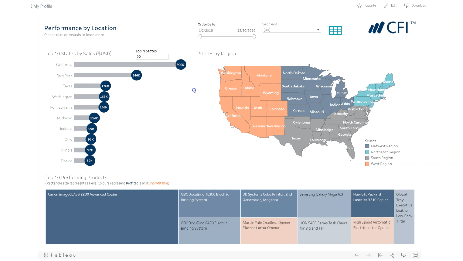
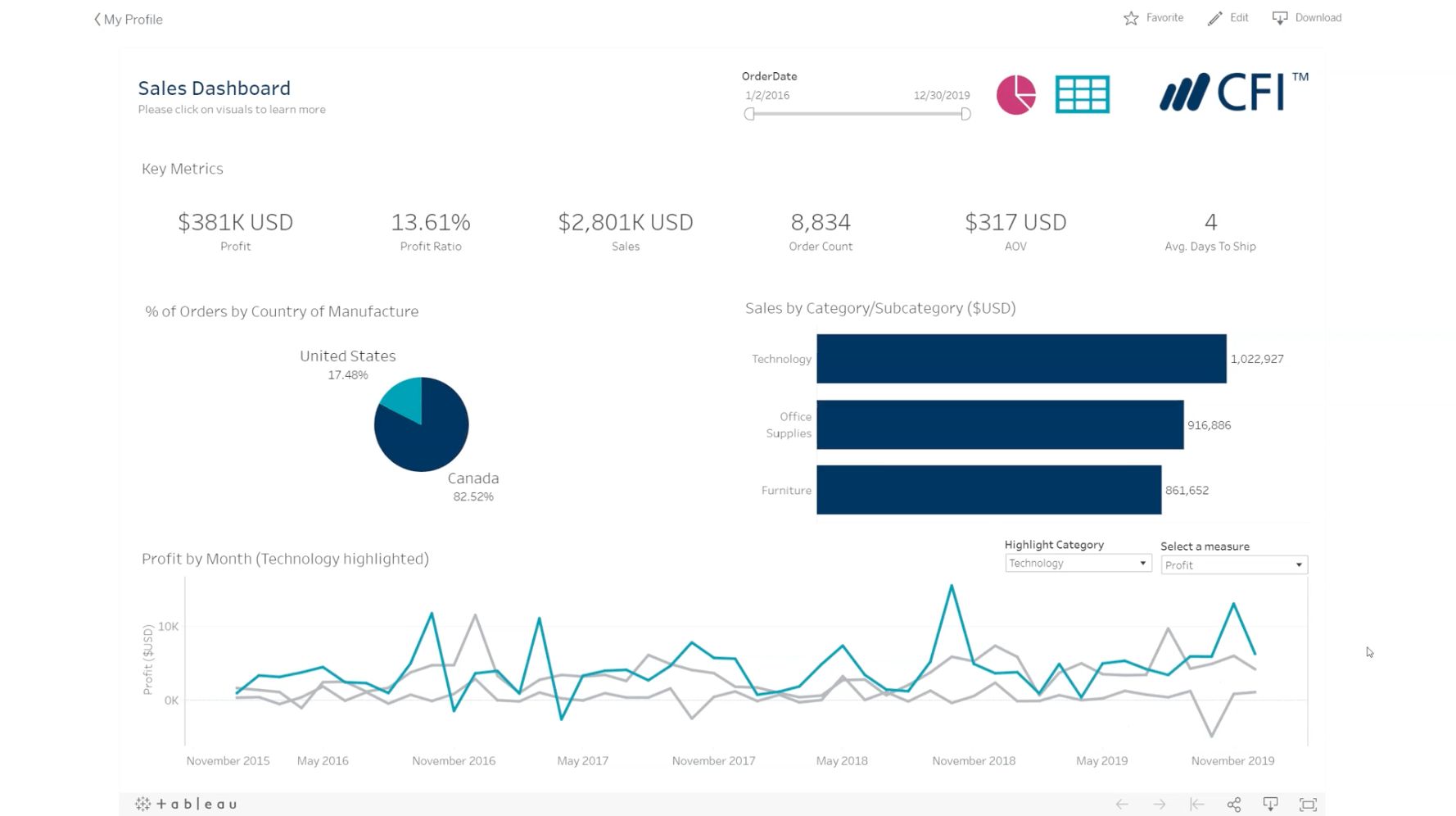
This course provides step-by-step instructions on how to build stunning, interactive visuals in Tableau before publishing them as part of dashboards in Tableau Public. You’ll learn techniques that help you prep and manipulate your data before creating calculations that help deliver business insights.
At the end of each chapter, you’ll apply the skills you’ve learned to hands-on examples using alternative scenarios. We also provide a fresh dataset for the final assessment, giving you yet another dataset on which to test your skills.By the end of the course, you’ll be able to create interactive dashboards in Tableau that will deliver powerful and meaningful data-backed stories. You’ll be proficient in the basics of Tableau Public, and you’ll have a few tricks up your sleeve to create visuals and dashboards that impress.
Tableau Fundamentals Learning Objectives
By completing this course, you will be able to:
-
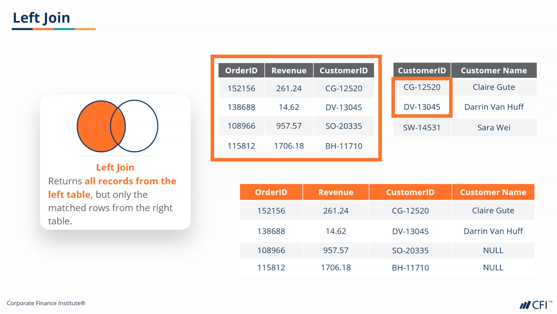
Import, transform, and combine data from different tables to create a Tableau dataset.
-
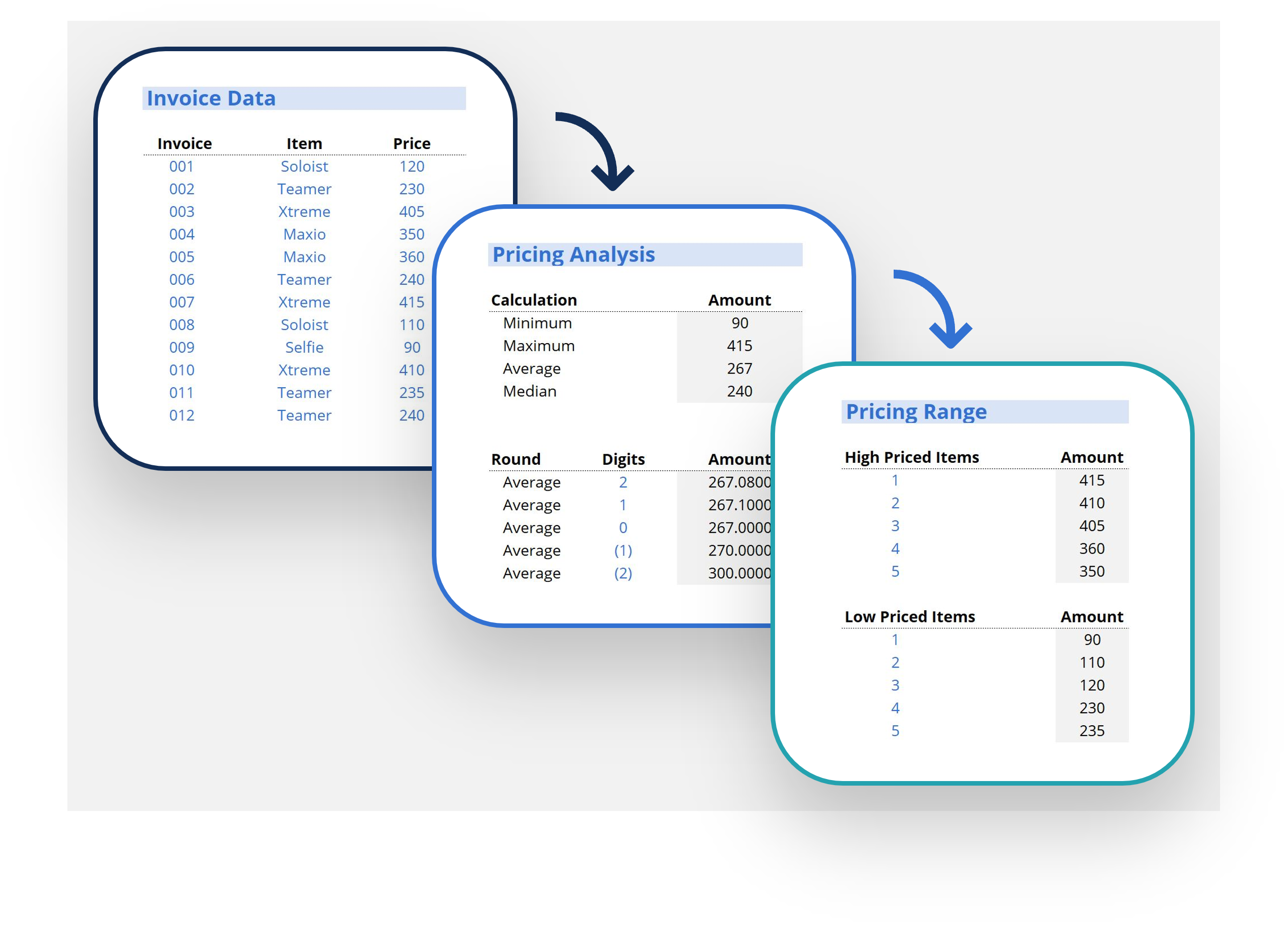
Use basic and table calculations to turn data into meaningful metrics.
-
Create the most common and popular visuals, along with a variety of interactive features such as slicers and timelines.
-
Give users options of which metrics to see, or which to highlight in a given visual.
-
Create stunning, insightful, and interactive dashboards using multiple visuals.
-
Use simple tricks like collapsible containers to give your dashboards a professional edge.
Who should take this course?
This Tableau course is perfect for professionals who have a solid understanding of data analysis and want to expand their skill set to include Tableau’s world-leading visualizations. This course is designed to equip anyone who desires to begin a career in business analysis—or other roles that require displaying and analyzing data sets—with a fundamental knowledge of this core tool.Tableau Fundamentals
Level 3
Approx 8h to complete
100% online and self-paced
Get StartedWhat you'll learn
Transforming Data
Mastering Calculations
Creating Visuals
Dashboard Design
Course Summary
Qualified Assessment
This Course is Part of the Following Programs
Why stop here? Expand your skills and show your expertise with the professional certifications, specializations, and CPE credits you’re already on your way to earning.
Business Intelligence & Data Analyst (BIDA®) Certification
- Skills Learned Data visualization, data warehousing and transformation, data modeling and analysis
- Career Prep Business intelligence analyst, data scientist, data visualization specialist
Business Intelligence Analyst Specialization
- Skills learned Data Transformation & Automation, Data Visualization, Coding, Data Modeling
- Career prep Data Analyst, Business Intelligence Specialist, Finance Analyst, Data Scientist

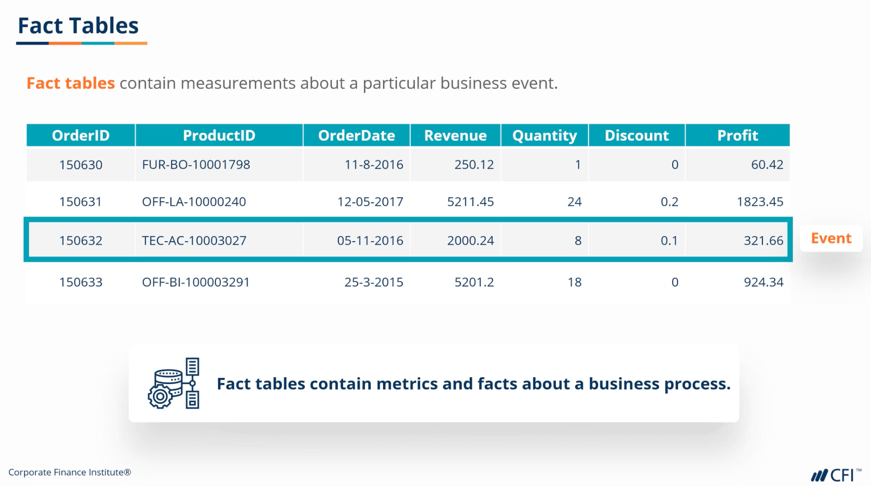 At the end of each chapter, you’ll apply the skills you’ve learned to hands-on examples using alternative scenarios. We also provide a fresh dataset for the final assessment, giving you yet another dataset on which to test your skills.
